In the world of data visualization, column charts are a staple. Easy to understand and versatile, these charts are very efficient for representing data. With multiple forms of data display available, the go-to for most individuals is column charts. Providing visual inferences, they are a practical choice for categories that are discrete or have no specific order. They facilitate quick comparisons between different categories, enabling viewers to make immediate inferences, conclusions, or predictions. This allows for speedy yet tactical decision-making processes. Keep reading for the column chart explained.
Understanding the Why: The Advantages of Using Column Charts
Alt text: An example of a column chart overlayed on an image of a room.
Column charts are not only easy to create but can also handle a wide variety of data types, making them a versatile tool for any data analyst or decision-maker.
They are particularly effective when there is a need to compare various values simultaneously, helping to crystalize trends and patterns that might not be visible in a simple data table alone.
Moreover, the simplicity in design and clarity in their visual expression allow a broad audience to comprehend these charts’ information. Ranging from scientists to laymen, anyone can understand a column chart’s contents regardless of their level of data literacy.
Therefore, column charts’ swift comprehensibility and universal applicability make them essential for data storytelling or decision-making.
The Building Blocks: Essential Elements of a Column Chart
The real strength of a column chart lies in its straightforward structure. While it might appear simple on the surface, each element of a column chart provides vital statistical information.
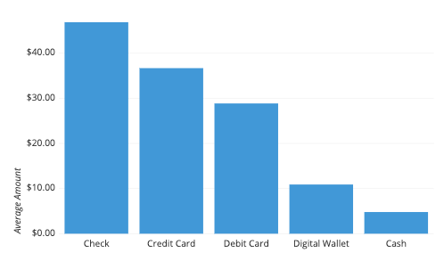
The main elements include the horizontal or ‘X’ axis, which represents the categories being compared, and the vertical or ‘Y’ axis, which represents the magnitude of these categories. The length of each column provides a quantitative measure of the category’s size or frequency.
Color coding can also be an essential element of column charts. This can facilitate the identification of different subgroups, break down categories, and enhance the visualization and analysis of complex data sets.
Understanding these elements is paramount to the successful creation and the apt interpretation of column charts. The accuracy of these elements ultimately dictates the integrity of the information conveyed in your chart.
Step-By-Step Procedure: Creating Effective Column Charts
Successfully creating a column chart requires a systematic approach. This begins by first understanding and determining the scope and aim of the chart. What are you trying to convey, and to whom?
Once your objectives are clear, selecting the data accurately and arranging it in the right manner is your next task. Sorting your data can help reveal patterns and discrepancies that were otherwise hidden.
The next stage involves designing the chart. Factors like choosing a suitable size, ensuring uniform bars, and deciding on the right level of granularity are crucial here.
Finally, don’t forget the importance of testing your chart. This involves refining, enhancing, and ensuring that your chart successfully conveys the intended message in the simplest manner possible.
Critical Takeaways in Mastering Column Charts Usage
Alt text: A person working on a computer utilizing data to create column charts.
The comprehensive guide above shows that column charts, while seemingly simple, demand strategic planning and apt execution for effective data visualization.
Realizing their potential and versatility, their usage goes beyond mere data representation. They can bolster decision-making, augment data storytelling, and assist in predictive analysis.
Mastering the technique of column chart creation and interpretation, therefore, can significantly enhance your data analysis skills.
Effective column chart utilization can prove invaluable in many circumstances, whether for professional use in reports, presentations, research papers, or personal use.
Using column charts is integral to modern data analysis—allowing for quick, understandable, and insightful inferences. Their versatile applications and universal comprehensibility make these charts a boon for decision-makers, researchers, and non-specialists alike.